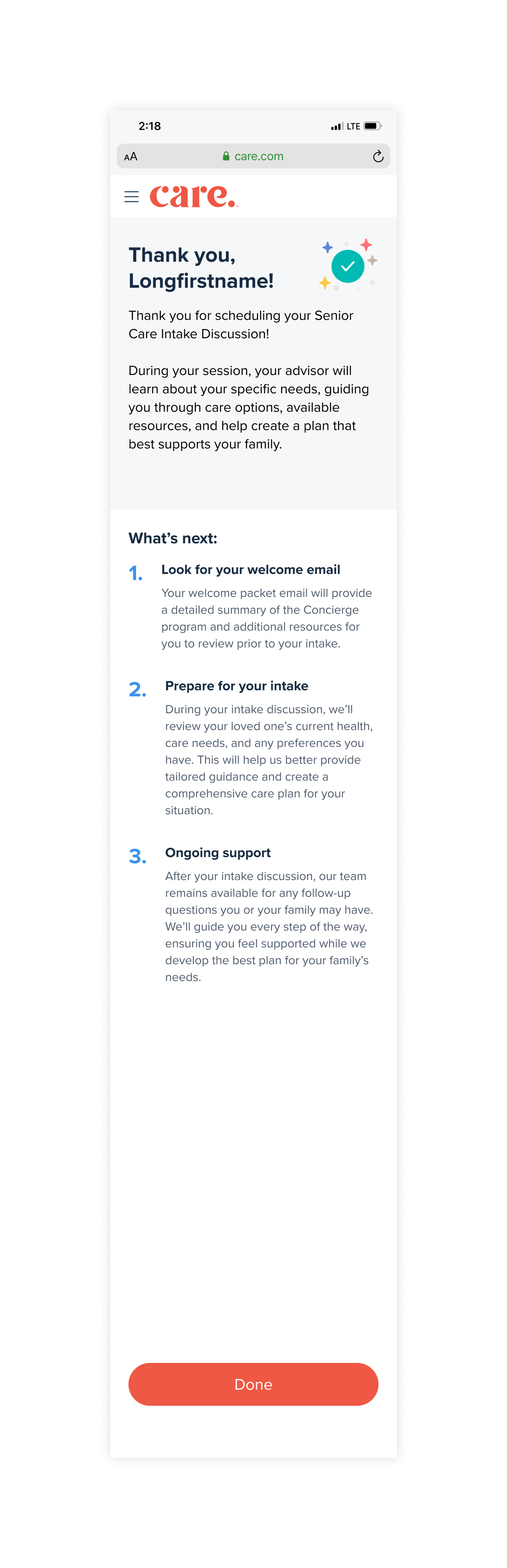
Nuanced contributions that drove revenue
- Pre-rate card content: Distilled a complex, unfamiliar service into a header and three bullets that gave users just enough context to feel confident moving forward.
- CTA optimization: Tested "Get an Advisor" vs. "Learn More" to understand whether users needed reassurance or momentum at the decision point. The data told us which one converted.
- Landing page content: Collaborated with the GM for Adult Care and legal to translate the full service vision into clear, compliant copy for users who had zero prior knowledge of the product.
- Data leveraged: Moderated UX studies, Seeker Council feedback, Facebook elder care community groups, exit survey data and CTA A/B test results.
How we designed it
Two entry points — helping users find the right kind of help.
Users arrived at Senior Care Advisor from two distinct entry points: One actively seeking guidance through a quiz and the other who had just completed enrollment and may not have been looking for an add-on service at all. The content for each entry point had to meet users where they were.
Guided onboarding quiz
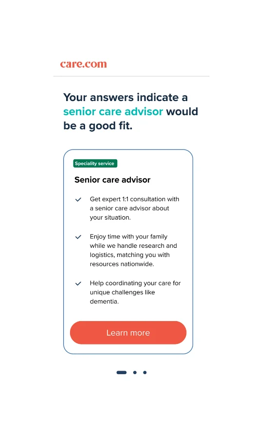
On the quiz result screen, 'Your answers indicate a senior care advisor would be a good fit' uses the user's own responses as the rationale for the recommendation—making it feel personalized rather than promotional.
Pre-rate card
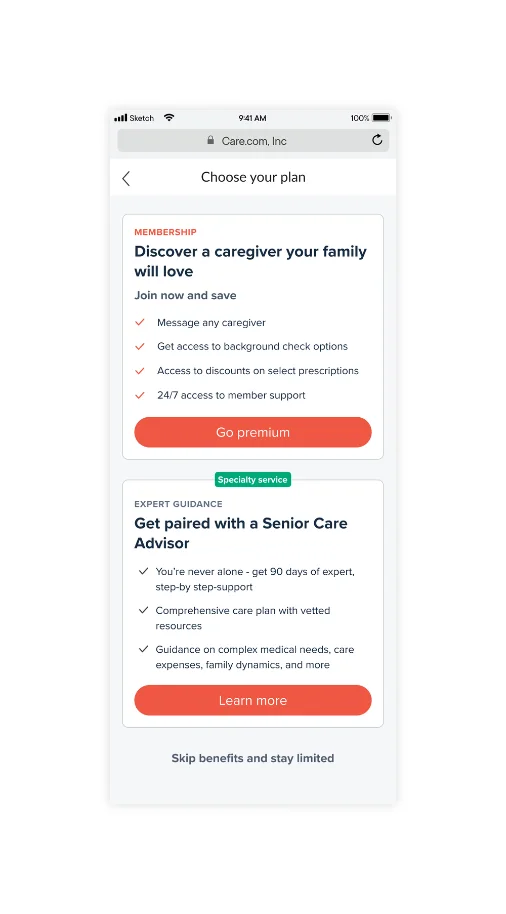
The post-enrollment pre-rate card had a different job: introduce a brand new service to someone whose primary task was already complete, without feeling like an upsell. Both screens intentionally use 'Learn more' over something more aggressive like 'Buy now'—a deliberate low-pressure content decision for users who may be navigating a stressful family situation and need to feel in control of the pace.
Rate Card
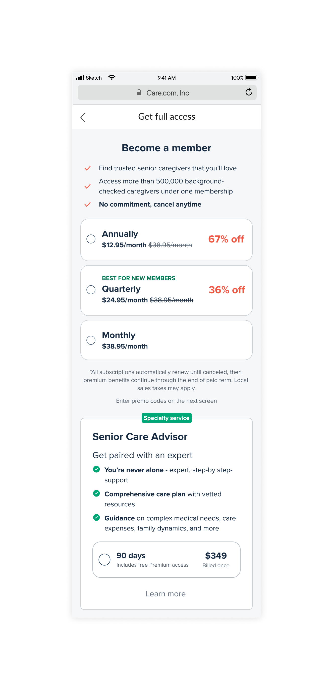
Users arriving at this screen had just learned about a new specialty service. The content challenge was making three pricing options feel clear and worth comparing—without overwhelming a user.
Landing Page
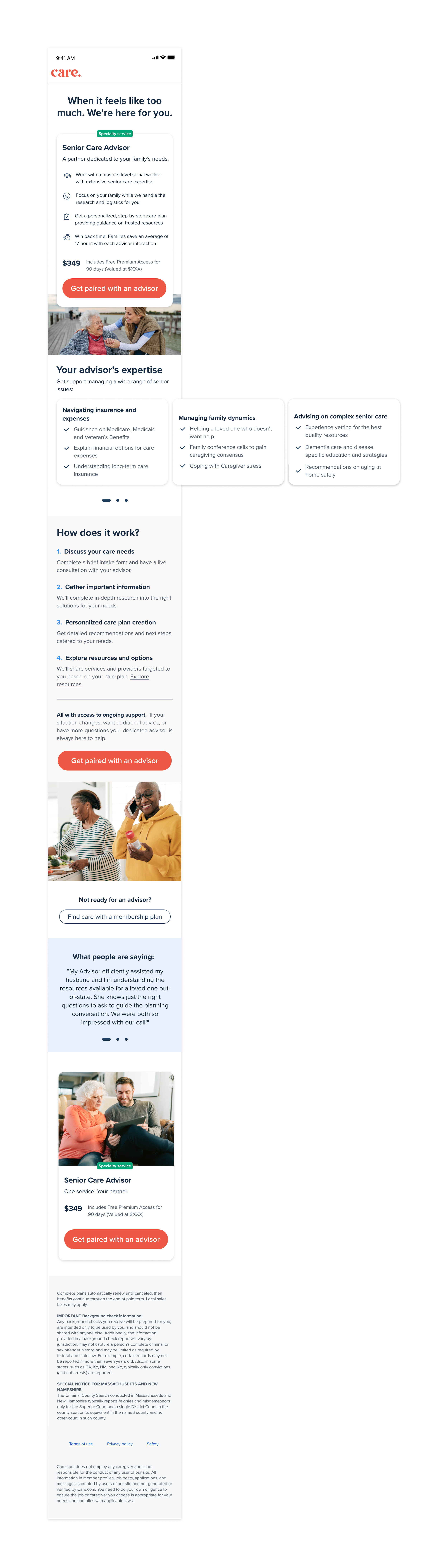
The headline was designed to lead with empathy before selling. Users arriving at this screen are often in a stressful family situation — the content needed to acknowledge that before presenting a product. Distilling the full scope of the service into three clear categories required deep collaboration with the GM and subject matter experts to understand what users actually needed to see — not just what the service offered. The 'how it works' sequence was designed to reduce purchase anxiety by making an unfamiliar service feel concrete and predictable. All building to a CTA that clearly names the action while leaning into the emotional weight of the decision — 'Get paired with an advisor' is something we've earned the right to ask the user, over something transactional like 'Buy now' or earlier in the flow.
Calendly booking
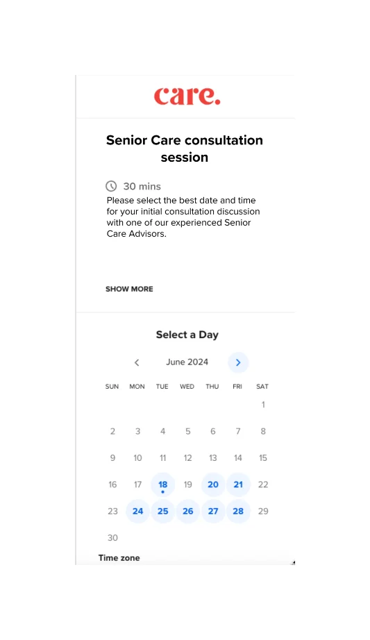
The booking screen was a third-party Calendly integration with limited customization options. The content challenge was ensuring the language leading into this screen — particularly the CTA 'Get paired with an advisor' — did enough emotional and contextual work to carry users through the transition into an unbranded interface without losing momentum or trust.
Confirmation screen
The confirmation screen is often an afterthought — but for a high-consideration, emotionally charged purchase, it's one of the most important moments in the journey. A user who just committed $349 to help a vulnerable family member needs immediate reassurance that they made the right call. The 'What's next' sequence was designed to eliminate post-purchase anxiety by making the path forward feel clear and supported before they even close the tab.